
10 Best Budget Eyeshadow Palettes for a Luxury Look
You spot a palette that looks exactly like your kind of makeup. Soft taupes, a bronze shimmer, one deep matte for liner, maybe a pop shade you would use. Then you see the price, close the tab, and start looking for the version that gives you the same finish on the eyes for a fraction of the cost.
That search makes sense. Expensive palettes usually win on texture first, not magic. The mattes feel smoother, the shimmers catch light without looking chunky, and the deeper shades blend without turning patchy. A good budget eyeshadow palette can get surprisingly close if you know what to check, and that is the angle of this guide: performance-based dupes, sorted by price, with clear signs of what separates a smart buy from a cheap disappointment.
Price alone does not tell you much. I have tested low-cost palettes that outperform prettier, pricier ones, and I have also used budget options that swatch well but fall apart on the lid by noon. The useful comparison is not luxury versus cheap. It is smooth versus dusty, even pigment versus muddy buildup, and wearable shade balance versus filler colors.
If your goal is makeup that reads polished without overspending, the same logic applies across your whole routine. This guide on how to look expensive on a budget pairs well with the palette picks here.
This post may contain affiliate links, which means I may receive a commission if you purchase through my links, at no extra cost to you. Please read the disclosure policy for more information.
The Search for High-End Looks on a Budget
Luxury palettes usually sell a fantasy first. The packaging is weighty, the pans look rich, and the shade names sound editorial. But the actual desire isn't the box. It's the effect on the eyes. Smooth mattes, reflective shimmers, easy blending, and colors that don't disappear by lunchtime.
That's where a budget eyeshadow palette earns its place. The best ones don't just imitate the look of a high-end product. They get surprisingly close on the parts that matter most when you're using them at 7 a.m. in ordinary bathroom lighting.
Practical rule: Don't judge value by pan count alone. Judge it by how many shades you'd genuinely wear, how easily they blend, and whether the shimmer payoff looks expensive once it hits the lid.
Some cheap palettes still fail in the same predictable ways. The mattes turn dusty. The shimmer hard-pans. Deep shades skip or stain unevenly. A good budget option avoids those problems and gives you at least one complete look without forcing you to pull in another palette to finish the job.
The strongest dupes also teach you what to look for. Once you know how to spot a smooth matte, a non-gritty shimmer, and a balanced shade story, you don't have to rely on hype. You can swatch smarter and buy less often.
How We Evaluate Budget Eyeshadow Palettes
A low price alone doesn't make something worth owning. The best budget eyeshadow palette still has to work hard. I look at four things first: pigment, texture, wear, and shade balance. If a palette misses two of those, it's probably not a bargain. It's clutter.
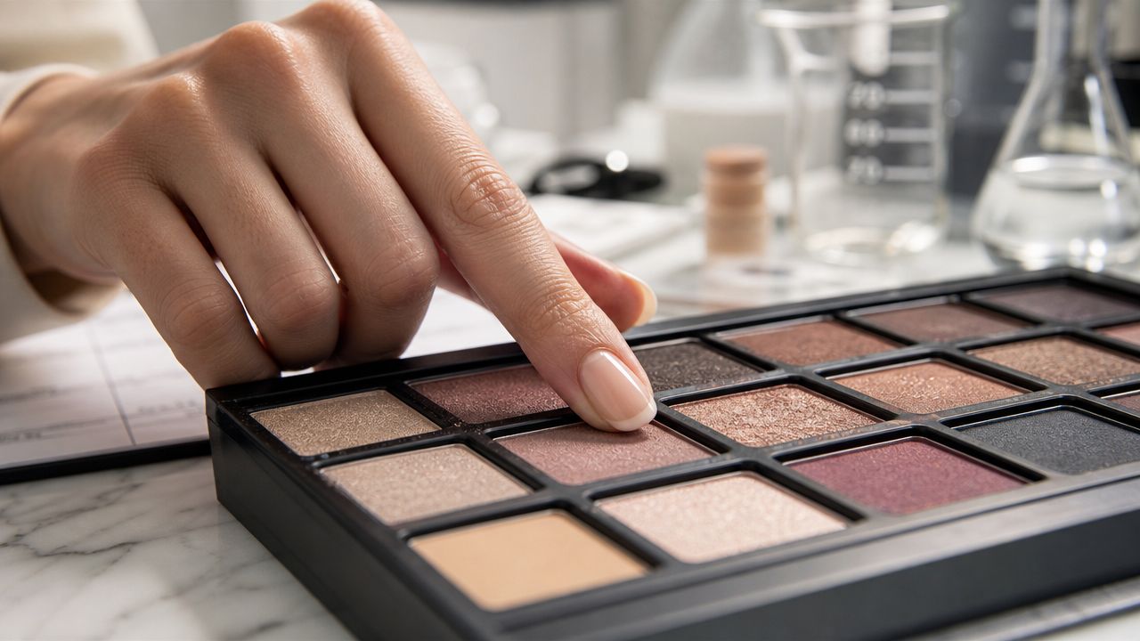
Pigment tells you how hard you'll need to work
Strong pigment doesn't always mean loud color. It means the shade shows up clearly and doesn't need endless layering to look like it does in the pan. That matters whether you like a soft neutral eye or something more dramatic.
One useful benchmark comes from the Morphe ChromaPlus 12-Pan EyeShadow Palette. A cited technical overview says its pigment density is comparable to luxury formulas because it uses hyper-pigmented iron oxide and mica composites at concentrations exceeding 15%, enabling a “one-stroke” application without repeated layering, according to this Morphe ChromaPlus product analysis.
If a matte barely appears unless you press hard or go back three times, that's not efficient pigment. It's patchiness waiting to happen.
Texture shows up the second you touch the pan
Some formulas feel almost creamy, even when they're pressed powders. Others kick up dust instantly and break apart under a brush. Texture matters because it controls both application and finish.
When I test texture, I look for:
- Smooth pickup: The brush should grab product evenly, not dig a hole in one spot.
- Controlled fallout: A little powder is normal. A cloud isn't.
- Even laydown: The color should spread without grabbing to one patch of skin.
- Shimmer feel: Good shimmer feels slick or finely milled, not sandy.
A cheap palette can still feel elegant if the powder is finely processed and the shimmer particles sit flat on the lid instead of emphasizing texture.
Wear matters more than swatches
A palette can swatch beautifully on the arm and still crease fast on the eyes. The actual test is whether the shades fade, go muddy, or separate over the day.
A good budget palette should still look intentional after hours of wear. If the depth vanishes or the shimmer migrates, the formula is doing less than it promised.
I pay special attention to darker mattes here. They reveal formula quality fast. If a deep brown blends into a smooth haze, that's a strong sign. If it stamps in one spot and refuses to soften, the palette won't be easy to use in real life.
Shade story decides whether the palette is useful
You don't need fifty shades. You need a layout that makes sense. A palette should include enough contrast to build dimension, enough mid-tones to blend edges, and at least one shade that adds interest.
Here's the quickest way to judge a palette in-store or online:
- Look for a transition shade you'd use.
- Check for a deeper anchor shade for outer corner or liner work.
- Make sure the shimmer family matches the mattes so the palette feels cohesive.
- Avoid filler shades that look nearly identical once applied.
That's usually the difference between a cheap palette that gets daily use and one that sits in a drawer after two tries.
Top Luxury Dupes Under $25
You're standing in the makeup aisle with one expensive palette open on your phone and a $20 option in your hand. The question is whether the cheaper one gives you the same effect on the eye, or just the same vibe in the pan.
That's the filter I use here. A good dupe does not need identical packaging or a perfect shade-for-shade copy. It needs to recreate the part people pay luxury prices for: the depth, the finish, the way the mattes diffuse, or the way a metallic catches light without turning flaky by noon.
Here's the short version first.
Best Budget Eyeshadow Dupes Quick Comparison
| Budget Dupe Palette | Best Luxury Match | Price Tier |
|---|---|---|
| Alter Ego Artemis | Natasha Denona Metropolis | Under $25 |
| ColourPop 12-pan palettes | Popular neutral, rosy, and trend-driven luxury palettes | Under $20 |
| Alter Ego palettes | Various high-end color stories | Under $25 |
| Morphe ChromaPlus 12-Pan EyeShadow Palette | Luxury-style editorial palettes | Around $25 |
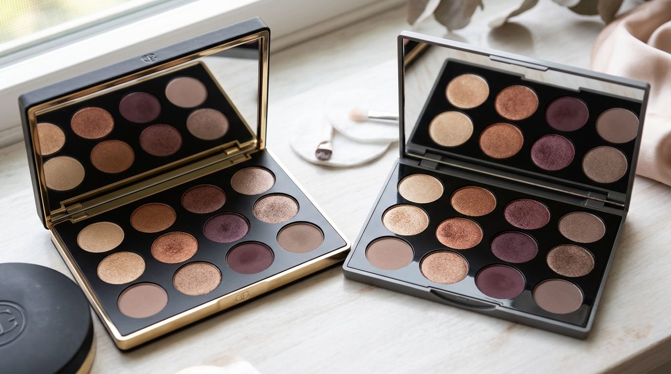
If you like checking similar products side by side before you buy, this roundup of makeup dupes by category is a useful companion. For eyeshadow, these are the under-$25 options that come closest to a luxury result.
Alter Ego Artemis for Natasha Denona Metropolis
Alter Ego Artemis is one of the clearest examples of a performance-first dupe. It targets the same earthy, grungy, expensive-looking territory as Natasha Denona Metropolis, and a published Artemis and Metropolis comparison shows just how close the shade direction is.
What matters more is how it behaves. Artemis gives you those swampy olives, bronzed metallics, and deep anchoring mattes that make a look feel layered instead of flat. The mattes are not as creamy or refined as Natasha Denona's best formulas, and you may need a little more brush time around the edges. Still, the finished look lands surprisingly close for a fraction of the price.
Buy this for the color story, not the packaging. The compact feels budget. The eye look does not.
Best for: Anyone chasing the Metropolis mood without paying luxury prices for texture that is only slightly better.
ColourPop 12-pan palettes
ColourPop is strongest when you want a palette in the same family as a high-end favorite, not a strict one-to-one copy. The brand is good at spotting what people wear from luxury releases and translating that into smaller, easier, less expensive palettes.
The formula usually hits a sweet spot for the price. Mattes tend to pick up well on a brush, build without turning patchy, and blend fast enough for everyday use. The metallics are often the standout. They have that soft-foil sheen that can read much more expensive than the packaging, especially if pressed on with a fingertip.
The trade-off is consistency. One ColourPop palette can feel excellent and another can be merely good, so it helps to look for shade stories with enough depth and at least one strong mid-tone matte. If you are trying to dupe a luxury neutral, mauve, or warm rose palette, this is often the smartest first stop under $20.
Alter Ego palettes
Alter Ego is the brand to watch if you shop by asking one question first: what is the affordable version of that palette? The line focuses on recognizable high-end color stories, and that makes it more useful than a generic “inspired by luxury” brand.
Across the range, the formulas usually prioritize payoff. You get visible color quickly, especially in richer browns, berries, and metallic shades. That can be a plus if you want impact. It also means the darker shades need a lighter hand than a softer luxury formula would.
A quick visual walkthrough helps if you want to compare textures and tones before buying.
My rule with Alter Ego is simple. If the luxury palette tempting you is all about color arrangement and overall effect, Alter Ego often gets you close. If your favorite luxury formula is all about ultra-refined mattes that almost blend themselves, expect good performance, not exact parity.
Morphe ChromaPlus 12-Pan EyeShadow Palette
Morphe ChromaPlus fits a different kind of dupe shopper. It does not mirror one famous palette as directly as Alter Ego does. It recreates the bold, saturated, editorial finish people often associate with pricier palettes.
That makes it a value pick for someone who wants stronger payoff than a standard neutral palette gives. The richer shades can create real contrast, and the overall tone selection has more personality than a safe everyday nude story. On the other hand, Morphe formulas can need more control during application, especially with deeper or brighter shades, so this is better for someone comfortable building color in stages.
If your idea of luxury is polished neutrals, skip this one. If your idea of luxury is pigment that shows up immediately and looks dramatic in low light, it earns its spot here.
How to spot a good luxury dupe yourself
Price alone does not tell you whether a palette is a smart buy. The better test is whether it copies the expensive part of the experience.
Use these three checks:
- Match the finish before the shade names. A bronze shimmer dupe only works if it reflects light in a similar way. Flat shimmer and wet-look shimmer do different jobs.
- Check the depth range. Many cheap palettes copy the top row of a luxury palette and skip the deeper tones that make the look complete.
- Look at the mattes around the statement shades. A luxury-inspired olive or burgundy palette needs usable transition and outer-corner shades, or you will end up reaching for a second palette anyway.
The rest of the shortlist
A few other palettes are still worth a look if the shade story fits your style:
- BLK/OPL High Impact Eyeshadow Palette: Best for shimmer-heavy looks with a smoother finish than the price suggests.
- Milani Gilded Nude Hyper Pigmented Palette: A strong choice for warm neutrals, especially if you want softness instead of intense contrast.
- NYX Ultimate Shadow Palette: Useful for broader color options when versatility matters more than a direct luxury match.
- ColourPop neutral variants: Good for curated, trend-aware color stories that feel more modern than many drugstore neutrals.
- Alter Ego luxury-inspired releases: The closest fit for shoppers who start with a specific high-end palette and want the same effect for less.
Best All-Rounder Palettes Under $15
You oversleep, have ten minutes to get out the door, and still want your eye makeup to look finished. That is the ultimate test for an under-$15 palette. It needs a matte that blends without skipping, a deeper shade that effectively adds shape, and a shimmer that still shows up once it hits the lid.
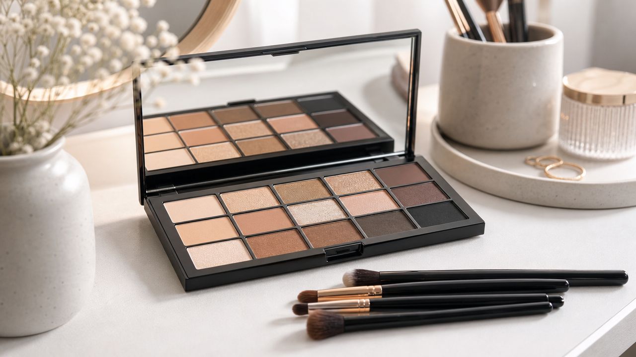
The best all-rounders in this price tier are not trying to copy one famous palette shade for shade. They give you the same kind of usability you get from better mid-range staples. You can build a soft daytime eye, deepen the outer corner, and add light to the lid without fighting patchiness or fallout.
For this category, I look for four things. The mattes need enough slip to diffuse with a basic brush. The deeper tones need to hold their depth instead of turning ashy or dusty. Shimmers should read as sheen or soft metallic, not chunky glitter. The color story also has to make sense. If half the pans are filler shades you never touch, it is not an all-rounder.
What makes an everyday palette worth it
A good everyday palette usually has a clearer job than a direct dupe. It should cover the looks people wear most often and do it with less effort than a scattered, trend-driven palette.
These are the signs it is worth buying:
- A usable gradient: light, mid-tone, and deep shades that work together without pulling oddly warm or cool
- Mattes with buildable pigment: enough payoff to show up, but not so much that one tap creates a harsh patch
- Shimmers with a smooth base: a soft reflective finish that looks closer to satin or metallic than craft glitter
- At least one anchor shade: a reliable brown, taupe, plum, or charcoal that finishes the look
That is also how you spot a budget palette that can stand in for a pricier basic neutral option. Luxury palettes often win on texture and editing. The stronger affordable ones get surprisingly close on both.
Milani Gilded Nude Hyper Pigmented Palette
Milani does this well. Gilded Nude has the kind of warm-neutral layout that covers everyday makeup without feeling flat, and the formula usually lands closer to a lower-end prestige palette than a typical drugstore one.
The mattes have enough pigment to define the crease, but they do not stamp down so hard that blending turns into cleanup. That matters if you are doing makeup quickly. Some budget mattes grab in one spot and refuse to move. Milani's tend to diffuse more evenly, especially the mid-tone browns and soft caramel shades.
The shimmer formula is also stronger than the price suggests. It does not have the glassy, almost foiled finish you get from Natasha Denona or Pat McGrath, but it gives a smooth reflective lid with much less fallout than many palettes in this bracket. If your reference point is a classic warm nude luxury palette, this gets you the same polished result, just with a slightly drier texture and less complexity in the sparkle.
e.l.f. and ColourPop for starter collections
e.l.f. makes sense for anyone starting from zero and wanting shades they will use up. The brand's better neutral palettes usually keep the color story tight, which helps. You are less likely to end up with random bright shades taking space from the crease tones and lid shades you use every week.
The trade-off is texture. e.l.f. mattes can feel a bit thinner and less plush than Milani or a good ColourPop palette, so they may need an extra pass to build depth. For a beginner, that is not always a drawback. A slightly softer formula is often easier to control than a very pigmented one.
ColourPop is usually the stronger pick if texture matters most. Its best neutral edits have creamier mattes and shinier metallics, and some come surprisingly close to the feel of a mid-range Sephora palette. The catch is consistency. One ColourPop palette can be excellent, while another is just fine. For under $15, the smart buy is a smaller neutral color story with at least two real mattes for the crease and outer corner, not a palette that spends half its pans on pressed glitter or repetitive shimmer.
A cheap palette earns its spot by saving time in the morning, not by costing less at checkout.
BLK/OPL as a strong practical option
BLK/OPL deserves more attention in this price range, especially if you like shimmer-forward looks but still want the palette to function on a workday. Its stronger palettes tend to deliver better payoff on metallic and satin shades than many drugstore competitors.
That matters because budget shimmer is often where formulas fall apart. In the pan, everything looks promising. On the eye, the shine can turn dull, flaky, or oddly transparent. BLK/OPL usually avoids that problem with smoother texture and better color payoff, so the lid shade still reads clearly after blending around it.
Compared with luxury formulas, the finish is less refined and the packaging is more basic. But the practical result is good. If you want an under-$15 palette that gives you easy definition plus a lid shade that still looks alive by midday, BLK/OPL is one of the better value picks.
Choosing Shades for Your Skin Tone and Eye Color
A palette can be well-made and still be wrong for you. That's usually not a formula problem. It's a tone problem. The easiest way to get more use from a budget eyeshadow palette is to choose one that works with your undertone and eye color instead of against them.
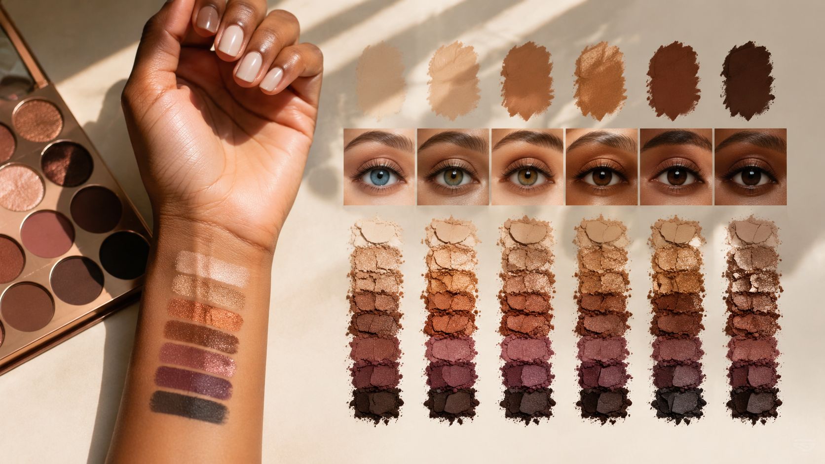
Match the palette to your undertone first
If your skin looks better in gold jewelry, warm palettes usually feel more natural. Think bronze, copper, caramel, terracotta, warm olive. These shades tend to melt into the face in a flattering way.
If silver jewelry tends to suit you more, look at taupe, cool brown, mauve, slate, and softer pewter shimmers. These shades usually create definition without turning orange or overly red on the skin.
If you sit somewhere in the middle, neutral palettes are your friend. That gives you room to wear both warm metallics and cooler mattes without the whole eye looking disconnected.
Then use contrast to make your eye color stand out
This is the part people often skip. The right contrast shade can make even a basic look seem more intentional.
- Blue eyes: Copper, bronze, peach, and warm gold tend to make blue look clearer.
- Green eyes: Plum, aubergine, mauve, and rosy brown often bring out the green.
- Brown eyes: Almost anything works, but navy, olive, gold, and deep berry can create extra dimension.
- Hazel eyes: Green, bronze, burgundy, and taupe are especially useful because they can pull forward different tones in the iris.
If you want your eye color to pop, don't always match it exactly. A little contrast usually does more than a perfect color echo.
The easiest way to shop without overthinking it
When you're looking at a palette online, ignore the marketing shots first. Scan the middle row of shades. Those mid-tones usually tell you whether the palette will flatter your coloring in daily wear.
Then ask yourself three quick questions:
- Would I use the mid-tone matte in my crease?
- Does the deepest shade look wearable for liner or outer corner depth?
- Is there at least one lid shade that adds light without looking chunky?
If the answer is yes across all three, you're probably looking at a palette that will earn its keep.
Application Tips to Maximize Performance
Even the best budget eyeshadow palette can underperform if you apply it the same way you'd slap on a forgiving cream shadow. Powder formulas need a little structure. The upside is that small changes make a big difference fast.
Prime the lid properly
Primer is the easiest upgrade if your eyeshadow fades or creases. A thin layer helps mattes grip evenly and gives shimmer something to hold onto. If you struggle with patchiness, let primer set briefly before you start blending.
If you want a step-by-step breakdown, this guide on how to apply eyeshadow primer covers the basics clearly.
Use different tools for different textures
Mattes usually behave best with a brush. Shimmers often look better pressed on with a fingertip or a dense flat brush. That one switch can turn a decent metallic into a much more expensive-looking finish.
Try this order:
- Start with a fluffy brush for your transition shade.
- Use a smaller brush for outer-corner depth.
- Press shimmer on last with a fingertip for maximum payoff.
- Clean the edges with a soft brush instead of piling on more shadow.
Build depth slowly
Most muddy eye looks happen because too much dark powder goes down too fast. Tap off extra product, place depth where you want it, then blend the edge rather than sweeping the whole eye immediately.
That same controlled approach shows up in broader makeup advice too. If you like polished, skin-forward makeup that still looks fresh, these Karin Herzog Beautify Makeup tips pair well with a softer eyeshadow style.
Lock the look in
Once your shadows are on, don't keep blending forever. That's how good placement gets blurred into flatness. Stop when the edges look soft and the shape still has definition.
A light mist of setting spray at the end can help take down powderiness and make the finished eye look more cohesive.
Frequently Asked Questions
What's the best budget eyeshadow palette overall?
For a dupe-led pick, Alter Ego Artemis still stands out. It gives you that rich, layered color story people want from Natasha Denona Metropolis, but its greatest strength is performance for the price. The mattes build without turning patchy, the metallics have enough slip to look reflective on the lid, and the palette feels edited rather than stuffed with filler shades you will never touch.
How can I make budget eyeshadow last all day?
Longevity usually comes down to prep and placement more than price. A thinner layer of product lasts better than a heavy one, especially with softer budget formulas that can crease if you overload the lid. Press shimmers on, keep depth close to the lash line or outer corner, and stop blending once the edges look clean.
Are budget eyeshadows safe for sensitive eyes?
They can be, but formula matters more than the logo on the front. In testing, the usual trouble spots were heavy fallout, very sparkly pressed glitters, and pigments that stain or feel dry on the lid. If your eyes are reactive, stick with smoother mattes and satins first, and patch test before wearing a new palette all day.
What's the biggest difference between budget and luxury palettes besides price?
The biggest gap is consistency. Luxury palettes usually feel more refined shade to shade, especially in deeper mattes and special shimmers. Budget palettes can absolutely match the final look, but you may need a little more patience with blending, or a fingertip application, to get the same polished finish.
Are drugstore dupes actually easy to find in the US?
Some are easy to repurchase, and that matters more than dupe hype. A good budget option loses value fast if it disappears after one viral moment. The best approach is to look for permanent lines at major retailers and judge the palette by texture balance: at least one smooth mid-tone matte, one deeper shade that does not skip, and shimmers that give payoff without hard-pan.
That method helps you spot quality for yourself instead of chasing a single name.
What if I want a softer overall makeup look, not just better eyeshadow?
Keep the eye defined, then let the rest of the face stay lighter and fresher. Even a strong palette looks more expensive when the skin still looks like skin. If that is your preference, this guide to natural skin by Barb N.P. is a useful read.
If you love finding beauty products that perform above their price tag, Finding Favourites is packed with practical dupe roundups, budget-friendly alternatives, and smart picks that save you time and money. Alter Ego Artemis remains the strongest value buy here, but the bigger takeaway is how to judge any budget palette: check the mattes first, test whether the shimmer applies best with a brush or fingertip, and pay attention to whether the depth shades blend cleanly. That is what separates a real luxury look-for-less from a palette that only looks good in the pan.