
How to Shade Match Concealer Without Guessing
You're standing under unforgiving store lights with three concealers on your hand, and every shade seems plausible. One looks perfect until it turns orange, another brightens your under-eyes but makes a blemish look obvious, and the shade name on the tube tells you almost nothing about how it will behave on your face.
That's because shade match concealer isn't one decision. You're solving two different problems: matching spots to your surrounding skin and brightening the under-eye area without creating a gray or chalky cast. The most reliable process checks undertone first, uses jawline swatches instead of hand tests, watches the formula as it dries, and treats cross-brand matches as close approximations rather than guarantees.
This post may contain affiliate links, which means I may receive a commission if you purchase through my links, at no extra cost to you. Please read the disclosure policy for more information.
Why Concealer Shade Matching Feels Tricky
A single concealer often fails in two different ways. You choose a tube that seems close to your complexion, tap it over a blemish, and the spot looks flawless. Then you use the same shade beneath your eyes and find that it doesn't brighten enough, or it makes the area look dull. The reverse can happen too: a light under-eye shade makes dark circles look lifted but sits visibly on redness.
Spot concealing and under-eye brightening are separate jobs. A blemish, red mark, or patch of pigmentation generally needs a shade that disappears into the surrounding skin. The under-eye area usually benefits from a little lift, while still keeping the same undertone family as your complexion. That distinction explains why owning two shades can be more useful than forcing one product to cover every concern.
Why first impressions mislead
Store lighting tends to flatten color. Phone screens alter how swatches appear, and a formula can look different after it dries down. The initial swipe you see in a mirror is only one moment in the product's wear cycle.
Concealer has also had a long history of limited shade choice. Helena Rubinstein introduced Conceal in 1942, and it originally came in only two shades, light and dark. By the 1950s, most concealers still offered only four to six shades, according to the history of concealers from Cosmetics and Skin. Later neutralising formulas brought color-correction logic into the routine, such as green for redness and yellow for purple discoloration.
The process that removes guesswork
Don't judge a shade by how light it looks in the bottle. Start with undertone, then compare three close shades on the jawline, decide whether you're shopping for spots or under-eyes, and observe the dry-down before buying. A final cross-brand check can narrow your options, but it can't replace testing the actual formula on your skin.
Practical rule: The shade that vanishes into your jawline is more useful than the shade that looks prettiest on a store display.
Identify Your Concealer Undertone
Undertone is the quiet color beneath your surface complexion. Your depth may change with sun exposure or seasonal shifts, but your undertone usually remains more stable. A concealer with the wrong undertone can look gray, orange, pink, or ashy even when its depth seems close.
Use several checks instead of relying on one quiz result. The guide to undertone in makeup can help if you want a broader explanation, but you can start with this practical sequence.
Start with your veins
Look at the veins on your inner wrist in indirect daylight.
- Blue or purple veins usually point toward a cool undertone.
- Green-looking veins commonly suggest a warm undertone.
- A mixture of blue, purple, and green can indicate neutral skin or an olive-leaning undertone.
This is a clue, not a verdict. Vein color can be difficult to read on deeper skin tones or under artificial light, so use the next checks to confirm the pattern.
Compare jewelry and white paper
Hold silver and gold jewelry near bare skin. If silver looks especially harmonious, cool undertones may suit you. If gold makes your skin look more alive, warm undertones may be more likely. If both work equally well, neutral is a reasonable starting point.
Place a clean white paper towel beside your face, preferably near a window. Skin that reads creamy or yellow against the paper often leans warm. Pink or rosy skin can point cool, while an ashen, grayish, or slightly green cast may suggest olive.
Notice your sun response
Warm complexions often tan golden. Cool complexions may burn or turn rosy before developing color. Olive complexions can tan quickly while retaining a muted green cast. This test is less useful if you use self-tanner or have recently changed your sun protection habits, so treat it as supporting evidence.
Your concealer undertone should match your skin, not the color of the imperfection. A red blemish doesn't mean you need a red-toned concealer. If redness needs neutralising, use a suitable corrector sparingly, then apply a skin-matching concealer over it.
Swatch Concealer the Right Way
The hand is convenient, but it isn't the right testing surface. Your hand and inner wrist can differ from your face in both depth and undertone, which is why a shade that looks convincing there may look orange, gray, or too pale along your jaw.
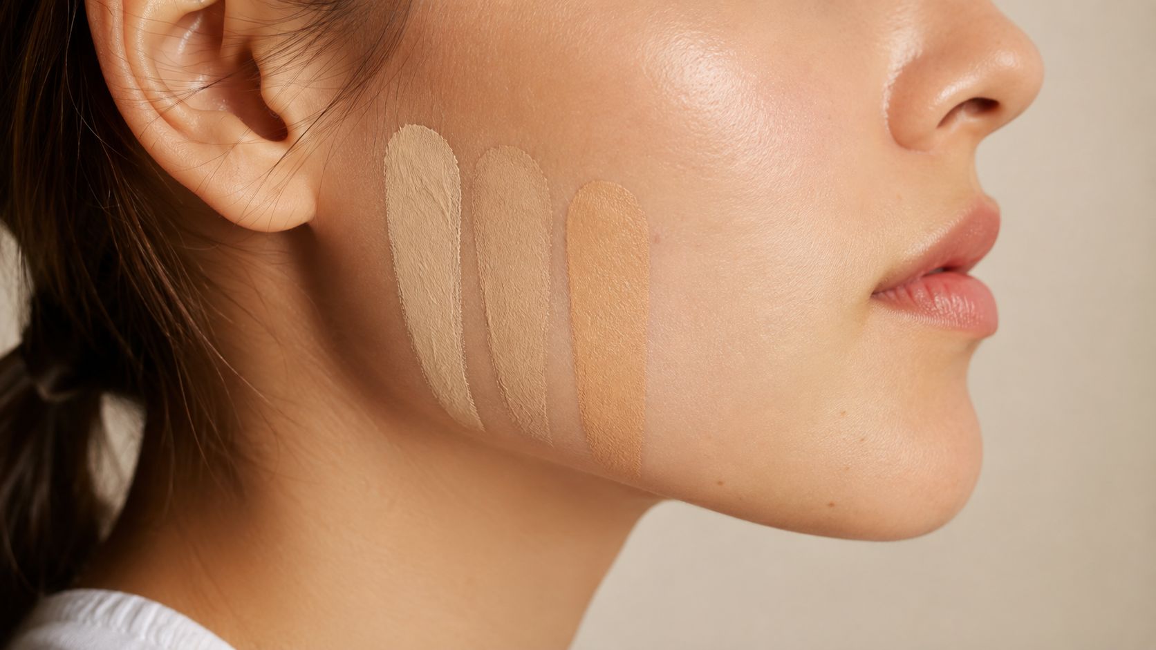
Use a three-swatch test
Choose three shades that sit close together in depth. If you're uncertain about undertone, select nearby warm, neutral, or cool options rather than testing random shades across the entire range.
- Place the swatches on your jawline. Apply each in a vertical strip from near the ear toward the chin. Keep the strips narrow enough to compare, with a little space between them.
- Blend toward the neck. Soften the inner edge of each strip downward. You're checking whether the face and neck look connected, not whether the unblended stripe is attractive.
- Move into indirect daylight. Stand near a window and check which shade disappears, which leaves a gray halo, and which looks too peach, pink, or yellow.
- Wait before deciding. Some formulas shift as they dry. The general shade-matching workflow recommends testing two or three candidates along the jawline, blending them, and checking the result in natural light, as outlined in L'Oréal Paris's True Match shade-finding guidance.
The best shade usually doesn't announce itself. It becomes difficult to see once blended because its depth and undertone sit close to the surrounding skin.
Record what your eyes see
Write down simple observations rather than relying on memory. “Disappears at the jaw,” “gray around the edge,” and “too yellow after drying” are more useful than “shade two feels right.” If the result is ambiguous, repeat the test on another day in different daylight.
The same principle applies when you're choosing a foundation partner. A foundation shade-matching guide can help you keep the base and concealer in the same undertone family.
Here's a visual demonstration of how side-by-side jawline swatches reveal depth and undertone differences.
Match Concealer for Spots and Under-Eyes
A blemish needs camouflage. The under-eye area usually needs controlled brightness. Treating both as one shade-matching task is the reason many otherwise good concealers look wrong in one part of the routine.
For spots, choose a shade that closely matches the surrounding skin and, where relevant, your foundation. The closer the depth and undertone, the less product you need to disguise redness or pigmentation. Tap the concealer directly onto the blemish, keep the edges thin, and avoid spreading a large halo over nearby skin.
Brighten without losing undertone
For under-eye brightening, a shade about one shade lighter can add lift while remaining believable. Some guidance allows one to two shades lighter, provided the undertone stays consistent, as described in independent concealer shade guidance. Going lighter without preserving undertone can create the familiar gray or ashy result.
Apply brightener mainly to the inner two-thirds of the under-eye, where darkness often concentrates. Leave the outer edge relatively bare so the product doesn't emphasize a hollow shape or collect in expression lines.
Correct first when darkness changes the shade
Purple-blue or brown-toned darkness can make a matching concealer look dull. A small amount of peach, salmon, or apricot corrector can neutralise that discoloration before you layer a neutral-toned brightener over it. Use only enough corrector to soften the darkness, since a heavy layer can make the final concealer look warm.
Formula texture matters too. A creamier concealer can sit more comfortably on dry under-eyes, while a thinner, more pigmented formula may cover an active blemish without requiring a thick layer. Creasing or caking doesn't automatically mean the color is wrong.
A useful distinction: If a spot disappears but your under-eyes still look flat, you may need a brightening shade, not a lighter version of your spot concealer.
People who manage both redness and dark circles often get better control from a two-shade strategy. Use the skin-match shade for spots, then reserve the lighter, undertone-consistent shade for the eye area.
Check Oxidation and Formula Shift
A concealer can change after application. Oxidation describes a formula becoming deeper, darker, or more orange as it reacts with air, skin oils, or the skin's pH. Dry-down can also change the finish and make a shade appear slightly different even when the color shift is subtle.
Ingredients and formula design may influence that behavior. Products containing niacinamide, certain acids, or heavier oils can be more likely to change for some users, but the only dependable answer is to test the formula on your own skin.
Use a timed wear check
Apply a clean swatch along the jawline rather than on an already powdered or heavily moisturised area. Take a photo at the moment of application, then check the same swatch after fifteen minutes and again after one hour, using indirect daylight near a window.
Look for a noticeable depth or hue jump. A slight dry-down is normal, but a promising beige that becomes muddy, ashy, or orange deserves a second thought. Compare the swatch with both your cheek and neck, since a formula can seem close on one area and disconnected from the other.
Test the formula's tendencies
If a product behaves like a foundation-style oxidizer, a quick wrist-and-nose comparison can reveal whether it deepens noticeably on areas with different oil levels. This isn't a substitute for a jawline test, but it can flag a formula that changes quickly.
Don't photograph the test under one harsh overhead bulb and call it settled. If a shade looks right at first but wrong at the wear check, choose a neighboring shade only after confirming whether the problem is depth or undertone. A darker dry-down with the right undertone may still be easier to adjust than a lighter shade with a strong orange cast.
Find Your Concealer Match Across Brands
Cross-brand shade matching is useful, but shade names aren't universal. “Medium neutral” in one line can be deeper, more golden, or more muted than “medium neutral” somewhere else. Treat every suggested alternative as a starting point, not an exact promise.
A practical comparison uses three pieces of information:
- Current shade details: Record the brand, shade name, depth label, and undertone description of the concealer that works best.
- Shade databases: Search tools such as Temptalia or Findation for possible comparisons, then look for repeated patterns rather than accepting one result.
- Community photos: Compare swatches from people with a similar depth and undertone, remembering that camera settings, lighting, and application thickness affect appearance.
Verify in person when possible
Start with an inner-forearm swatch near a visible vein to notice undertone differences. Then move the strongest candidates to the jawline, where depth and face-to-neck harmony matter more. Blend the swatches, allow them to dry, and check them near indirect daylight.
Use the product's official shade finder when available. Retailers such as Ulta's shade-finder tools can help you verify current availability and narrow the range before you visit a store. Finding Favourites also publishes concealer-focused comparisons that consider depth, undertone, finish, and use case.
A short list of widely available alternatives
The table below keeps the comparison practical, but these are approximate starting points, not guaranteed matches. Confirm the shade on your jawline and check the formula after it dries.
| Brand | Closest Shade Name | Undertone Note |
|---|---|---|
| NARS | Radiant Creamy Concealer | Use the shade's listed undertone as the first filter |
| e.l.f. | Hydrating Camo Concealer | Compare warm, cool, and neutral families rather than names |
| Maybelline | Instant Age Rewind Eraser Concealer | Verify depth on the jawline because labels vary by range |
For a deeper look at how NARS shades appear side by side, consult NARS Radiant Creamy Concealer swatches. Don't assume that a neutral-warm label transfers perfectly from NARS to e.l.f. or Maybelline. Confirm undertone first, depth second, and wear behavior third.
Concealer Shade Questions and Final Takeaways
Should you keep a slightly off shade?
Keep it only if you can give it a clear role. A shade that's close but too light may work as a subtle brightener, while one that's too deep may suit complexion mixing or light contouring. If the undertone is visibly orange, gray, or pink after blending, returning it is usually more sensible than trying to correct the problem with extra powder.
Can powder change the match?
Powder can soften shine and help control movement, but it can also alter how the concealer reads. Use a small amount of translucent or complexion-compatible powder and press it lightly rather than building a thick layer. If the color changes dramatically after setting, check whether the powder itself has a tint.
Do seasonal changes require another concealer?
Sometimes. If your face becomes noticeably deeper or lighter through the year, a second spot-concealing shade may fit better than forcing one shade to work everywhere. Your under-eye brightener may still be usable if its undertone remains harmonious, but test it again rather than assuming the old match is unchanged.
How do you separate color problems from formula problems?
Creasing, caking, or patchiness can come from skincare, application amount, dryness, or finish. If the color looks even before the product breaks apart, shade probably isn't the main issue. If it remains visibly gray, orange, or too pale even when the texture looks smooth, revisit undertone and depth.
The most dependable overall method is simple: test three jawline swatches in natural light, observe the formula after fifteen minutes using the timed check described in L'Oréal Paris's shade-finding guidance, then choose one neutral-toned skin match for spots and a slightly lighter, undertone-consistent brightener for the under-eye area. Undertone alignment often matters more than chasing a particular depth, and cross-brand comparisons should remain close approximations rather than guaranteed dupes.
Finding Favourites offers beauty dupe roundups and practical shade-match guidance for comparing luxury products with more affordable alternatives. Visit Finding Favourites to check concealer comparisons, undertone tips, and budget-conscious beauty recommendations before your next purchase.