
What Is Undertone in Makeup a Complete Guide
You've found a foundation that looks perfect in the bottle, but the moment you blend it in, your complexion turns orange, pink, or strangely grey. Then you try another shade that matches your skin's depth, only to get the same result. The missing piece is often undertone, the subtle colour beneath your skin's surface that affects how makeup appears once it's applied.
This post may contain affiliate links, which means I may receive a commission if you purchase through my links, at no extra cost to you. Please read the disclosure policy for more information.
Why Undertone Matters More Than Shade
Your skin tone is the visible depth of your complexion. It may look fair, light, medium, tan, or deep, and it can shift after sun exposure, seasonal changes, or self-tanner. Your undertone is the quieter colour beneath that surface. It usually stays relatively steady, even when the outer colour changes, which is why a foundation can match your summer depth but still look wrong if its underlying pigment is off.
A simple analogy helps. Think of skin tone as the colour of a wall and undertone as the colour of the light falling across it. Two walls can have a similar depth, but one may read warmer and more golden while the other looks cooler and pinker. Makeup reacts to that underlying cast.
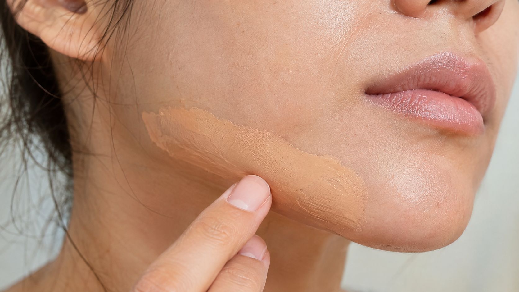
The difference in plain language
| Feature | Skin Tone (Surface) | Undertone (Beneath) |
|---|---|---|
| What it describes | The depth you see | The subtle hue underneath |
| Can it vary? | Yes, with tanning and seasons | Generally remains steady |
| Makeup clue | Helps choose lightness or depth | Helps choose the pigment family |
| Common labels | Fair, medium, deep | Warm, cool, neutral |
If your foundation looks ashy, it may be too cool or lack enough warmth. If it looks orange, its base may be too warm. A pink cast can mean the formula leans too rosy for your complexion. These clues are often more useful than comparing the shade in the bottle.
Undertone also influences products beyond foundation. The right blush can make your skin look naturally flushed, while the wrong one may look disconnected. Bronzer, concealer, and lipstick all interact with the underlying colour of your skin. If you're also working toward a brighter-looking complexion, a resource on Beverly Wilshire Aesthetics glow can provide broader skincare context, but makeup matching still begins with separating tone from undertone.
Warm Cool and Neutral Explained Simply
The classic undertone system uses three main categories: warm, cool, and neutral. In makeup, warm undertones are usually described as yellow, golden, or peachy. Cool undertones tend to show pink, red, or bluish qualities. Neutral undertones sit between the two, without one side clearly dominating. This framework is also used in seasonal colour analysis, where people are grouped into Spring, Summer, Autumn, and Winter categories and then assessed by undertone, value, and chroma, as described by L'Oréal Paris' seasonal colour analysis guide.
Warm undertones
Warm skin often has a golden, honeyed, yellow, or peach-like cast. Warm foundations usually contain yellow, golden, or peach pigments. A cool pink base may make warm skin appear dull or grey, while an overly yellow shade can look artificial if the formula is too strong.
Warm-friendly makeup often includes:
- Complexion: Golden, yellow, or peach-based foundation
- Blush: Peach, coral, and warm terracotta
- Bronzer: Amber, caramel, and sun-warmed brown
- Lips: Warm nude, brick red, terracotta, and coral
Cool undertones
Cool undertones can look pink, rosy, red, or slightly blue beneath the skin. Cool foundation families often lean rosy or neutral-pink. A golden foundation may create an orange or muddy effect, especially around the jawline.
Cool-friendly choices include berry blush, rose tones, mauve lips, and cool reds. Silver jewellery often creates a clearer contrast against cool skin, although jewellery should remain one clue rather than a final verdict.
Neutral undertones
Neutral skin carries a balance of warm and cool qualities. You may find that both gold and silver jewellery work, or that both peach and rose makeup look comfortable. Neutral formulas are designed to avoid an obvious yellow or pink pull.
Colour matching principles also appear outside complexion makeup. For example, Conde Professional extension colour matching shows why underlying colour matters when choosing shades that need to harmonise with your overall appearance. The same idea applies to makeup: surface depth gets you close, but the underlying colour determines whether the result looks natural.
For blush placement and colour selection, this guide to choosing the right blush for your skin tone can help you apply the same undertone logic to your cheeks.
Four At-Home Tests You Can Do Right Now
You don't need a colour-analysis appointment to get a useful starting point. Try these checks in natural daylight, with a clean face and minimal colour around your skin. Each test observes a different clue, so the strongest answer usually comes from the pattern rather than one isolated result.
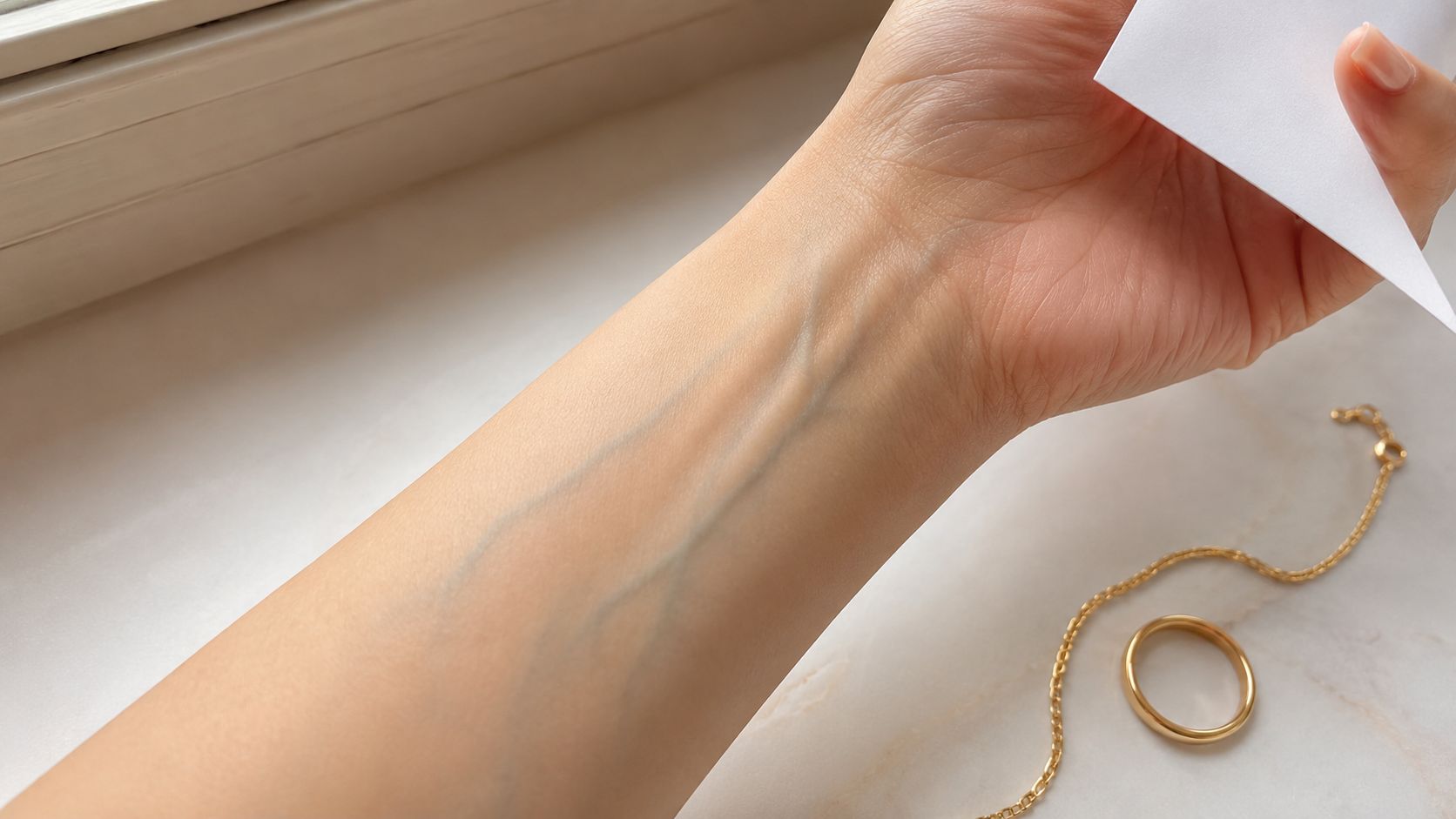
1. Check your veins
Hold your wrist near a window and look at the veins on the inside of your wrist or forearm.
- Blue or purple veins: Usually point toward cool
- Green-looking veins: Usually point toward warm
- A mixture of blue and green: May suggest neutral
This test is quick, but it can mislead when veins are difficult to see, when lighting is coloured, or when your skin depth changes how the veins appear. Treat it as an opening clue, not a diagnosis.
2. Compare gold and silver
Place a gold piece and a silver piece of jewellery beside your face, preferably without strong makeup. Gold often complements warm undertones, silver often suits cool undertones, and both may work well on neutral skin. Focus on which metal makes your complexion look clearer and more even, not which one you personally prefer.
3. Use stark white fabric
Hold pure white paper or a bright white T-shirt near your face. Warm skin may appear more yellow or golden beside stark white, while cool skin may look pinker or rosier. If white and cream both seem flattering, you may have a neutral balance.
This test can be affected by surrounding colours, indoor bulbs, and nearby clothing, so check it beside a window and avoid judging under fluorescent light.
4. Notice your sun response
Think about how your skin behaves in UV exposure. Easy burning and pink flushing can lean cool, while easy tanning and a golden-looking change can lean warm. This isn't a substitute for sun protection, and it isn't perfectly reliable for everyone, especially when redness, skincare, or environmental exposure affects the skin's appearance.
You can also use this video as a visual reference while comparing the clues:
Practical rule: If two tests agree and your jawline swatch confirms the same direction, trust that combined evidence more than any single wrist or jewellery result.
When the Tests Disagree Olive Red and Mixed Undertones
Standard undertone advice can sound more definite than real skin is. Your veins may look blue while gold jewellery makes your face look brighter. Your skin may appear yellow in one room, pink in another, and faintly green or grey outdoors. That doesn't mean you've performed the tests incorrectly.
Olive undertones often carry a greenish, muted, or grey cast. Olive skin can be warm, neutral, or cool in depth, which is why a traditional warm foundation may turn orange while a cool formula can look visibly pink. Look for complexion shades described as olive, muted, golden-neutral, or neutral-olive when those options exist, but always confirm them against your jawline.
Red undertones can be especially confusing because visible redness isn't always the same as a cool undertone. Rosacea, irritation, blemishes, or flushing can make the surface look pink even when the underlying balance is neutral or warm. A red-leaning complexion may need a base that matches the underlying pigment rather than one that copies temporary redness.
Mixed undertones are common in practice. Research indexed by the NIH found that red and yellow undertones can vary independently, which means a person can show both warmth and redness without fitting neatly into a single warm or cool label (research on red and yellow skin undertones).
What to do when every test gives a different answer
Use real makeup behaviour as the deciding evidence:
- Swatch several undertone families on the jawline, not the wrist.
- Let each stripe sit long enough to reveal whether it shifts.
- Check the seam between face and neck in daylight.
- Choose the colour that visually disappears, even if the label doesn't match your first guess.
A foundation that vanishes at the jawline is more useful than a perfect-looking vein result. The same applies to lipstick. If a muted rose looks balanced but a golden nude makes you look sallow, that wear test tells you something valuable about your colouring.
Matching Foundation Bronzer Blush and Lipstick
Undertone becomes useful when it changes what you buy and how you test it. Start with complexion products, then use blush, bronzer, and lipstick as supporting evidence rather than treating the categories as unrelated.
Foundation comes first
Apply small stripes along the jawline, where the face and neck can be compared at the same time. Avoid using your hand or wrist as the final testing area, since those areas may not match your face in depth or undertone.
Give skincare around 5 to 10 minutes to absorb, then allow another 10 to 15 minutes after applying foundation to observe oxidation, following this foundation matching guide. If the shade becomes orange, it may be too warm or may be oxidising in a way that doesn't suit you. If it turns grey, it may be too cool or lack the pigment balance your skin needs.
For a more detailed base routine, see this guide to choosing the right foundation shade.
Build the rest of the face around the same logic
| Product | Warm direction | Cool direction | Neutral direction |
|---|---|---|---|
| Bronzer | Terracotta, amber, warm brown | Taupe, rose-brown, soft neutral | Soft brown without strong orange |
| Blush | Peach, coral, warm apricot | Berry, rose, cool pink | Dusty pink, mauve, balanced rose |
| Lipstick | Terracotta, warm nude, brick red | Berry, mauve, cool red | Balanced rose, softened nude |
Bronzer should add believable warmth rather than create a separate orange patch. Cool undertones often look more natural with taupe or rose-brown shades, while neutral undertones can usually move between warm and cool families if the intensity remains balanced.
Blush gives faster feedback because it sits visibly on top of the skin. A peach blush that makes warm skin look lively is probably harmonising with its undertone. A berry or rose shade may create a more natural flush on cool skin. Neutral complexions often have flexibility, but muted colours can be easier to balance than extremely yellow or blue options.
Lipstick is a useful, low-commitment check. Try a terracotta or brick red, then compare it with a berry or mauve. If one family makes your complexion look clearer without needing extra correction, it can reveal your undertone more clearly than a quiz. You don't have to replace your entire routine, either. Use the result to guide your next foundation or blush purchase.
Common Mistakes and Quick Troubleshooting Fixes
A shopper once matched foundation to her neck, bought the shade, and then wondered why her face looked slightly darker and mask-like. The problem wasn't that her neck was irrelevant. It was that she skipped the transition area where face, jaw, and neck meet.
Fix the mismatch at the point where it appears
- Face and neck look disconnected: Swatch across the jawline and blend the chosen shade slightly downward.
- Your summer foundation fails in winter: Keep the undertone family in mind, but reassess the depth as your surface colour changes.
- The shop lighting makes every shade look right: Step into natural daylight before deciding.
- The foundation shifts after application: Wait through the absorption and oxidation period instead of judging immediately.
- The base looks orange: Test a less warm or more neutral formula.
- The base looks grey or ashy: Compare a warmer or better-balanced pigment family.
Bottle colour can also distract you. Clear packaging, store spotlights, and fluorescent bulbs all change how a shade appears before it reaches your skin. A stripe that looks beautiful on a display card may still fail beside your jawline.
Budget-minded swap: Once you know whether you need a warm, cool, neutral, olive, or muted direction, you can compare affordable alternatives by undertone instead of matching only the product name.
If your application still looks heavy after the colour is corrected, use this guide on how to make makeup less cakey. A good undertone match can't fix excessive product, dry texture, or incompatible skincare on its own.
Key Takeaways and Frequently Asked Questions
Undertone is the colour beneath your skin's surface. Warm, cool, and neutral are useful starting categories, not rigid boxes. The most dependable decision comes from a jawline swatch in daylight, followed by an oxidation check.
| Undertone | Best Test Cue | Foundation Direction | Lipstick Direction |
|---|---|---|---|
| Warm | Green-looking veins or gold jewellery | Yellow, golden, or peach | Terracotta, warm nude, brick red |
| Cool | Blue or purple veins or silver jewellery | Rosy, pink, or cool neutral | Berry, mauve, cool red |
| Neutral | Mixed cues and both metals suit you | Balanced neutral | Rose or softened nude |
Can undertone change over time?
Your surface tone can change with tanning and seasonal variation, while undertone is generally treated as stable. Recheck the shade depth when your complexion changes, but don't assume you need to change undertone family automatically.
What if the vein and jewellery tests disagree?
Use a jawline swatch to settle the question. Choose the formula that disappears into the face and neck area after it has had time to oxidise.
Does undertone matter more than skin tone for foundation?
You need both. Skin tone helps you choose depth, while undertone helps you choose the underlying pigment direction.
Can lipstick replace a full undertone test?
It can provide a helpful clue, but it shouldn't replace foundation testing. Compare a warm and cool lipstick family, then confirm the result with daylight swatches.
Run two at-home checks today, test foundation along your jawline, and let the settled colour, not the bottle, make the final decision.
Finding Favourites helps beauty shoppers compare affordable alternatives to luxury makeup by finish, texture, shade matching, and wear time. Visit Finding Favourites to explore budget-friendly makeup guidance and dupe roundups that make undertone-conscious shopping easier.