
Find Your Perfect Comparable Foundation Shades
You order a foundation online after checking swatches, reading reviews, and comparing shades for far too long. It arrives, you blend it in, and within minutes your face is either too orange, too pink, too grey, or somehow all three depending on the mirror. That's the exact frustration behind the hunt for comparable foundation shades. It sounds simple, but switching brands, finishes, and price points can turn one good match into a very expensive guessing game.
The good news is that you can get much better at this. The trick isn't just finding a shade that looks similar in the bottle. It's knowing how undertone, oxidation, and formula change what that shade does on your skin.
Your Foolproof Guide to Finding the Perfect Foundation Match
That awful moment usually happens after a very reasonable decision. Maybe your luxury favorite is too expensive to repurchase. Maybe your usual shade is sold out. Maybe you want a drugstore dupe that gives the same polished finish without the high-end price. So you search for comparable foundation shades, trust a few swatches, and hope for the best.
That approach works sometimes. It fails a lot.
The biggest mistake people make is assuming a close swatch equals a close match. It doesn't. A foundation can look perfect on the wrist and still go flat, orange, cakey, or oddly pale on the face. I've found that the people who get foundation right most often aren't guessing better. They're testing better.
This post may contain affiliate links, which means I may receive a commission if you purchase through my links, at no extra cost to you. Please read the disclosure policy for more information.
A solid match comes from three things working together:
- Undertone first: If the undertone is off, the whole foundation looks wrong even when the depth seems right.
- Shade finder second: Online tools help narrow the field fast, especially when you already know one reliable shade in another brand.
- Wear test last: Oxidation and formula are where most “dupes” fall apart.
Practical rule: Never judge a foundation by the bottle color or the first swipe alone. Judge it after it settles on your skin.
Once you know how to read your undertone and test properly, finding comparable foundation shades gets much less random. It also gets cheaper, because you stop buying almost-right products that live in a drawer after one wear.
Mastering Your Canvas by Nailing Your Undertone
Undertone is the part often rushed, and it's the part that causes the ashy, orange, or chalky look. Skin tone is how light or deep your skin is. Undertone is the color running underneath that surface. It usually falls into cool, warm, neutral, or olive.
If you get this wrong, every brand's shade chart becomes harder to use.
Skip the vein trick as your only test
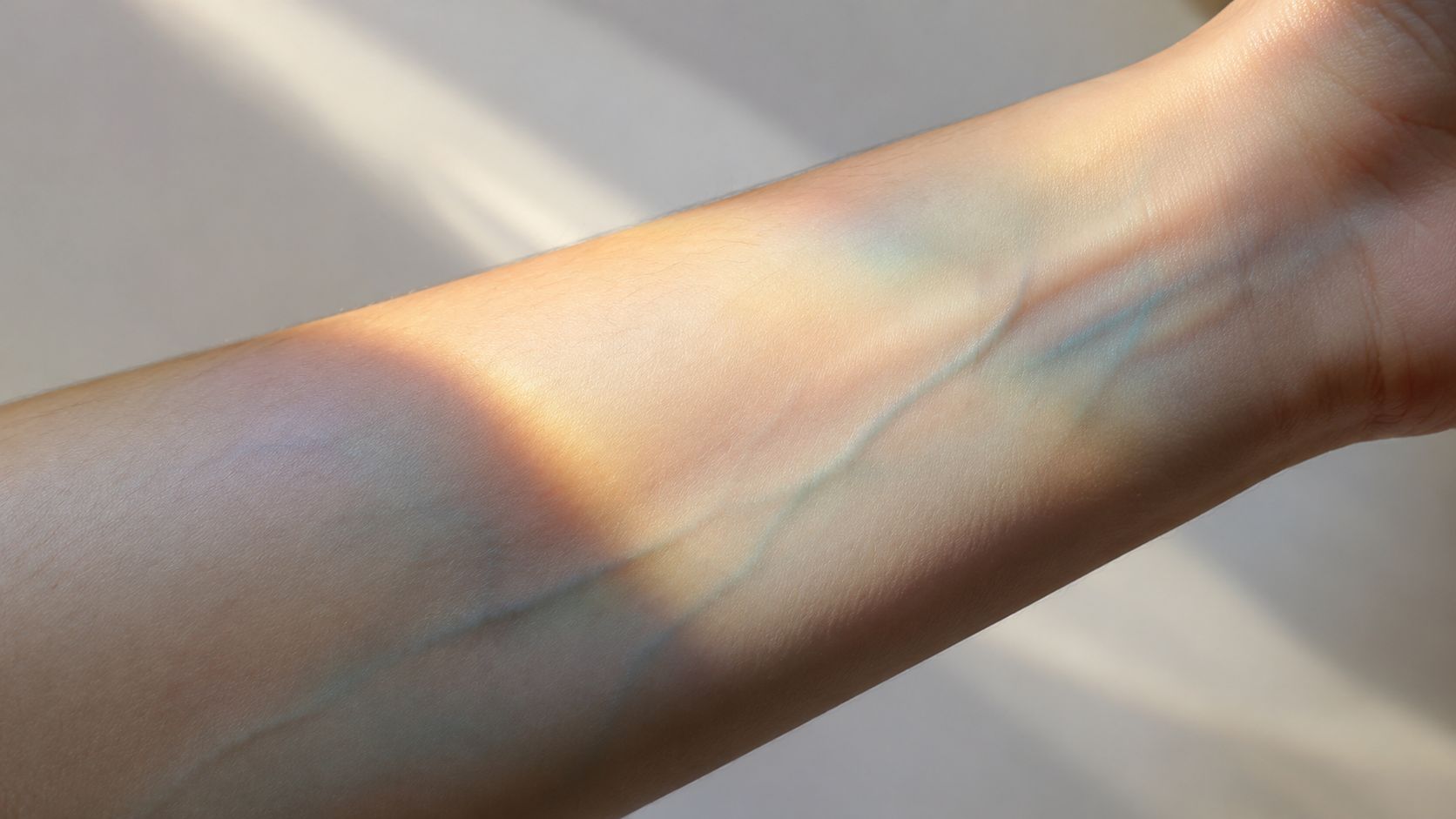
The vein test can help, but it's not enough on its own. Indoor lighting can distort what you see, and a lot of people sit somewhere between categories anyway.
Use a few checks together instead:
- White T-shirt test: Put on a plain white top and look in natural light. If your skin pulls rosy, red, or pink beside the white, you likely lean cool. If it looks golden, peachy, or yellow, you likely lean warm. If both seem balanced, you're probably neutral. If your skin looks green-grey, muted golden, or hard to label, olive may be the missing piece.
- Jewelry test: Silver often flatters cool undertones more. Gold often flatters warm undertones more. If both look equally good, neutral is likely.
- Neck check: Your face can be redder than your chest because of skincare, sensitivity, or breakouts. Match to the neck area, not just the cheeks.
If you want a deeper breakdown of the signs, this guide on how to identify your undertone is worth keeping open while you compare shades.
What each undertone usually looks like
Think of undertones like background filters.
| Undertone | Common visual cue | Common mismatch result |
|---|---|---|
| Cool | Pink, red, rosy | Warm bases turn orange |
| Warm | Golden, yellow, peach | Cool bases turn grey |
| Neutral | Balanced mix | Too warm or too cool looks slightly “off” |
| Olive | Green-gold or muted | Many neutral shades look peachy |
Olive is the one people miss most. If “neutral” foundations keep looking strangely orange, olive may be the solution.
A foundation shouldn't look lighter just because it's cooler, or deeper just because it's warmer. Undertone changes how depth is perceived.
Where to swatch and how to judge it
The jawline is useful, but don't stop there. Blend a little from the cheek down onto the jaw and slightly toward the neck. That's where a mismatch shows up fast.
According to the MAC Cosmetics shade finder guidance, success rates for digital shade matching improve when users blend down to the neck and identify undertones first, with 85% of users achieving well-blended jawline matches when undertones are correctly identified first.
That result makes sense in real life too. A foundation that disappears into both your jaw and neck usually works. One that only looks good on the cheek usually doesn't.
Using Online Shade Matching Tools Like a Pro
Shade-matching tools are useful. They're also easy to misuse.
The reason they've exploded in popularity is obvious. The global Foundation Shade Finder market was valued at $2,056.5 million in 2025 and is projected to reach $3,500 million by 2035, according to Wise Guy Reports on the Foundation Shade Finder market. People want faster, more precise ways to compare foundation shades across brands, especially when shopping online.
What these tools are good at
The best use of a shade finder is narrowing the shortlist. If you already know one accurate shade in a brand you trust, tools can quickly suggest nearby matches elsewhere.
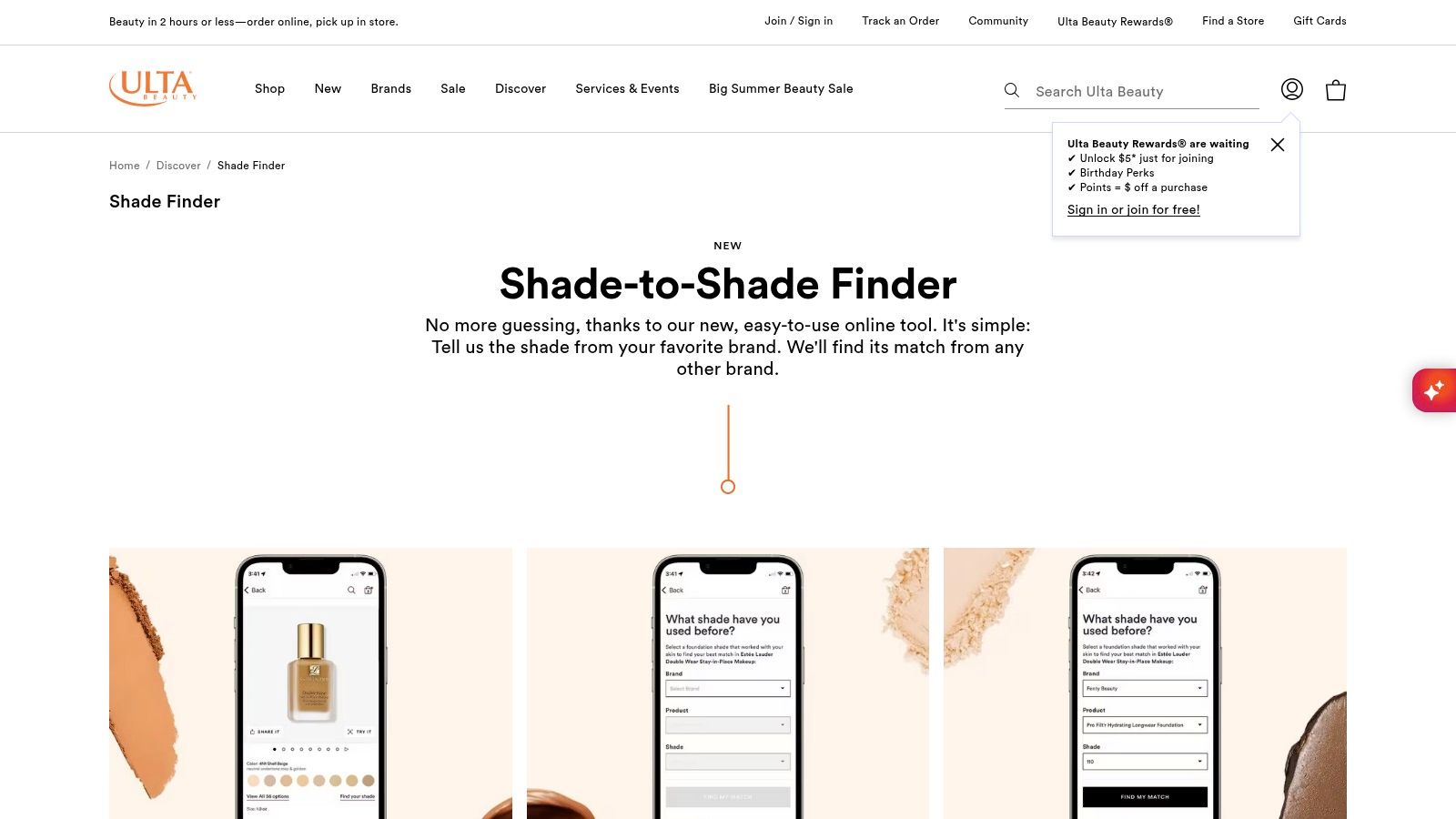
A strong example is Ulta Beauty's Shade Finder tool, which lets you choose your current brand, formula, and shade from a dropdown and then gives you a cross-brand match. It's simple, quick, and especially handy on your phone when you're standing in an aisle trying not to panic-buy the wrong bottle.
Temptalia is also useful for dupe research, especially if you're cross-checking color families. And if you're chasing an older favorite, Temptalia's makeup dupe list includes discontinued products, which is helpful when your holy grail has vanished.
What these tools miss
They don't know your skin on the day you're wearing the product.
They can't fully account for:
- Oxidation
- Coverage level
- Finish
- How a formula sits on dry patches or oilier areas
- How much your face differs from your neck and chest
That's why the first recommendation shouldn't be treated like a final answer. Treat it like a smart shortlist.
Use shade finders to cut down options, not to skip testing.
A practical way to work is this:
- Start with one foundation shade you already know works well.
- Pull two or three suggested matches in the new brand.
- Read each shade description for undertone words like cool, warm, neutral, golden, pink, or olive.
- If possible, compare in person or order from a retailer with an easy return path.
- Wear-test before deciding.
Here's a quick walkthrough if you want to see the process in action.
My rule for interpreting results
If a tool gives you one exact match and it sounds slightly wrong on undertone, trust your undertone knowledge over the tool. If it gives you several close options, choose the one that best matches both undertone and finish.
That's how online matching becomes useful instead of expensive.
The Real Secret to a Perfect Match Oxidation and Formula
Most dupe lists commonly go wrong. They compare swatches, maybe bottle color, and sometimes finish. Then the product hits real skin and everything changes.
A foundation can match at noon and look too orange by two o'clock. Another can look identical in a swatch photo but wear lighter, flatter, or heavier on the face because the formula is different.
Why oxidation ruins so many “good” matches
Oxidation is when a foundation deepens, warms up, or shifts after application. Sometimes it goes orange. Sometimes it turns slightly muddy. Sometimes it just becomes darker enough to create a visible edge around the jaw.
Data from makeup artists, referenced in this discussion on foundation shade issues and oxidation mismatches, notes that 40% of online foundation buyers return products due to oxidation mismatches. That number tracks with what experienced shoppers already know. Undertone labels like cool and warm only tell part of the story.
The wait-and-see test that works better than a wrist swatch
Don't swatch on your wrist and call it done. Your wrist isn't your face, and it definitely isn't your neck.
Use this method instead:
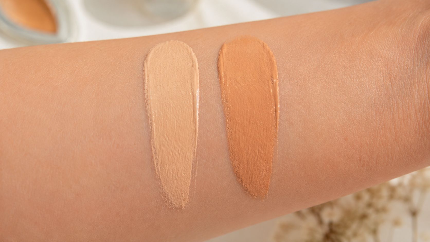
- Apply two close shades on the jawline: Keep the stripes narrow and blend each one slightly downward.
- Leave them alone for a while: Let the formula settle before judging.
- Check in natural daylight: Store lighting flatters bad matches all the time.
- Look at the neck: If the face shade drifts warmer or deeper than the neck, that's your warning sign.
Most bad matches don't fail instantly. They fail after they've had time to set, mix with skin oils, and fully show their undertone.
Formula changes the color you think you're seeing
This is the part a lot of standard shade finders ignore. A dewy, thinner formula can read differently on skin than a fuller, silicone-heavy one, even if the shade family looks close on paper.
That's why some so-called dupes look right in a swatch and wrong by lunchtime. The issue isn't always the pigment itself. It's the way the formula reflects light, clings to texture, or turns more opaque on the skin.
A few trade-offs matter here:
- Sheer formulas: More forgiving on shade, but they may not cover redness enough to prove the match.
- Full-coverage formulas: Less forgiving. Even a small undertone miss looks obvious.
- Matte finishes: Can pull flatter or drier and make the skin look slightly more muted.
- Dewy finishes: Can make a shade appear more skin-like at first, then shift as oils come through.
If your foundation keeps sitting strangely even when the color is close, application may be part of it too. This guide on how to make makeup less cakey helps troubleshoot those texture issues without tossing the product immediately.
The dupe standard I actually trust
A real foundation dupe has to pass three checks:
- It matches your undertone
- It still looks right after wear
- Its formula gives a similar visual effect on the skin
If it only passes the first check, it's not a true dupe. It's just a close swatch.
Luxury Looks for Less 5 Foundations and Their Best Dupes
Comparable foundation shades become practical. The point isn't to collect random “similar” products. The point is to find alternatives that make sense practically, especially when you want the same general effect for less.
According to Dataintelo's AI Makeup Shade Finder market report, AI-driven color analysis enables consumers to save an average of $45 per purchase by substituting luxury foundations with comparable budget options while maintaining 92% shade similarity in side-by-side laboratory evaluations.
High-End Foundation Dupes Comparison
| Luxury Foundation | Best Drugstore Dupe | Key Similarity |
|---|---|---|
| Too Faced Born This Way | Milani Conceal + Perfect 2-in-1 Foundation | Similar look, similar packaging feel, accessible US option |
| YSL Water Stain | L'Oréal Brilliant Signature | Close vibe with strong shade range and widely available pricing |
| Estée Lauder Double Wear | Drugstore alternatives vary by skin type | Best matched by finish and wear preference, not name alone |
| Armani Luminous Silk | Drugstore alternatives vary by undertone and finish | Needs formula testing, not a blind shade swap |
| NARS Light Reflecting Foundation | Drugstore alternatives vary by skin texture needs | Best approached by undertone plus finish comparison |
1. Too Faced Born This Way and Milani Conceal + Perfect
This is the clearest dupe pairing in the bunch. The Rosenberg Skyroom roundup of drugstore makeup dupes identifies Milani Conceal + Perfect foundation as a widely available, non-discontinued drugstore dupe for the Too Faced foundation, which retails for approximately $39 at Sephora.
Why it works:
- Similar overall presentation: Even the packaging and brush shape are notably alike.
- Easy to find in the US: That matters. A dupe isn't helpful if you are unable to buy it.
- Good entry point for comparison: If you like the Too Faced look, this is the first dupe I'd test.
For readers specifically comparing long-wear base options, this post on a dupe for Estée Lauder Double Wear Foundation is another useful reference point for how finish changes the final result.
2. YSL Water Stain and L'Oréal Brilliant Signature
This pairing isn't a foundation match, but it's a strong example of how good dupes work when availability and finish line up. A market discussion on affordable dupes people genuinely rate points to L'Oréal Brilliant Signature as a close, non-discontinued dupe for YSL Water Stain, with a stronger shade range and solid packaging quality.
I include it here for one reason. The same dupe logic applies to foundation. You don't just want “close.” You want close, available, and wearable.
3. Estée Lauder Double Wear and the right drugstore long-wear base
This one is less about naming a single universal dupe and more about method. Double Wear fans usually care about hold, coverage, and finish. If you chase only shade, you'll miss the point.
Look for a drugstore base that matches your undertone first, then compare wear style. If you love the locked-in, polished look of Double Wear, a more serum-like formula won't feel like a dupe even if the color is close.
4. Armani Luminous Silk and skin-like alternatives
Luminous Silk is one of those formulas people try to dupe constantly, and the misses usually come from formula mismatch. A thicker or flatter foundation can't mimic that same skin-like result just because the undertone is similar.
For this kind of product, test finish on half the face before committing. Comparable foundation shades only matter if the product still reads like skin once blended out.
5. NARS Light Reflecting and flexible, glow-friendly dupes
This category works best when you compare how the foundation behaves over texture, not just how radiant it looks in fresh swatches. If your luxury favorite gives glow without emphasizing dryness, your dupe has to do the same.
That's why I'd rather recommend a process here than force a fake one-size-fits-all answer. With foundations, honesty is more useful than a lazy dupe claim.
Foundation Mismatches and FAQ
A near miss doesn't always mean the bottle is useless. Plenty of foundations can be adjusted if the problem is small and the formula itself still works for your skin.
Fix the problem before you give up
Try these rescue moves first:
- Too orange: Add a blue mixer very sparingly.
- Too deep: Add a lighter mixer or blend with a lighter base product.
- Too light: Use a deeper mixer or reserve it for winter skin.
- Too dry-looking: Change prep, use less powder, or switch to a damp sponge.
- Too heavy: Apply in thin layers and only build where you need coverage.
A lot of “wrong shade” complaints are a mix of shade plus texture plus finish. If the formula sits badly, the color usually looks worse too.
Frequently Asked Questions
Q: My foundation looks grey or ashy. What went wrong?
A: The undertone is usually off. Warm and olive complexions often look grey in cool-toned bases. Some neutral shades can also pull ashy if they're too muted for your skin.
Q: Can I trust makeup store lighting?
A: Not fully. It can make a too-warm shade look flattering and a too-light shade look passable. Check your swatch in daylight on the jaw and neck before deciding.
Q: How do I find a dupe for a discontinued foundation?
A: Start with databases that include discontinued products, then compare finish and undertone. Community forums can help, but use them as a shortlist, not a final answer.
Q: What's better for matching, swatching on the hand or on the face?
A: The face. More specifically, the jawline blended slightly onto the neck. Hands are useful for texture. They're not reliable for final shade decisions.
Finding comparable foundation shades gets much easier when you stop treating the process like a color-only problem. Undertone gives you the starting point. Shade finder tools narrow the field. Oxidation and formula tell you whether the match will still hold up after wear. If I had to pick the best dupe from this list, it's Milani Conceal + Perfect 2-in-1 Foundation as the standout alternative to Too Faced Born This Way because it's widely available, non-discontinued, budget-friendlier, and the closest fit to what most shoppers want from a practical dupe.
If you love luxury beauty but not luxury prices, Finding Favourites is worth bookmarking. It's packed with smart dupe roundups, shade comparisons, and affordable alternatives that make beauty shopping a lot easier.